Vivian’s Boulangerie
2020
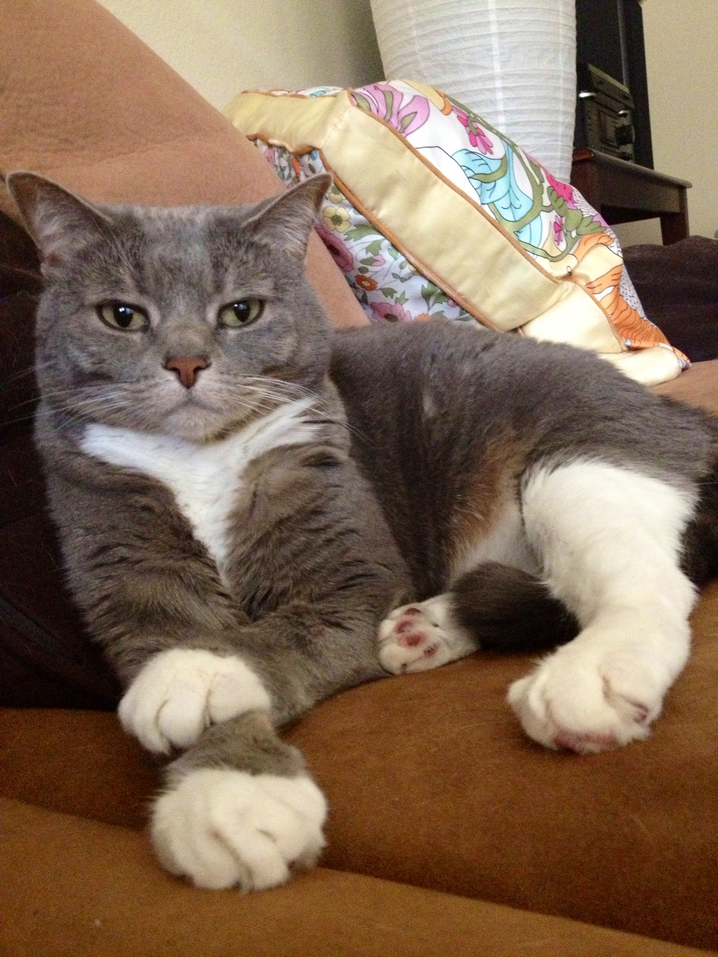
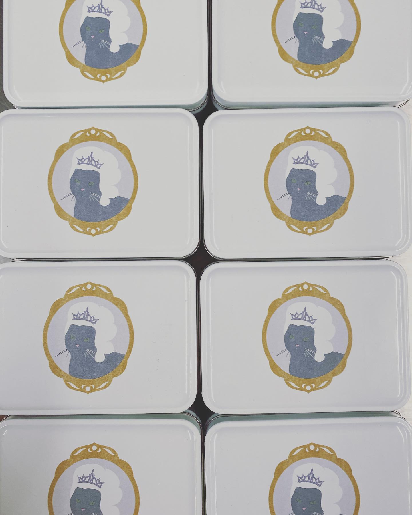
Vivian’s Boulangerie is a French-inspired bakery started by well-known Austin pastry chef Kendall Melton. With over a decade of experience, she wanted a brand reflective of her flavor-focused, high-technique pastries and fiery personality. Named after her late, very sassy cat (re-imagined here as Marie Antoinette) the brand aimed for — in her words — “a no-fucks-given, countryside royalty vibe.”
Key Responsibilities
Logo & Marks
Color
Typography
Digital illustration
Logo & Marks
Color
Typography
Digital illustration


︎ Behind the Design
I was inspired by Art Deco style and French label and packaging design. The limited color palette, shapes, typography and texture informed the design for the Vivian’s brand. I wanted the logo to look like it had been lovingly hand-stamped, which it eventually was.
Kendall was a dream client and we clicked instantly. During our intial call, she told me all about her cat Vivian, who the bakery would be named after. We were brainstorming additional visuals for the brand and Marie Cat-tionette was born between fits of laughter. I couldn’t imagine a more perfect mascot for this brand.


