In Good Taste Wine Brands
2022
In Good Taste is a direct-to-consumer wine company that sells tasting flights of wines in single-serving glass bottles. When I joined the team in 2021 as their first designer (!), the products had disjointed labels within a few loose “brands”. In conjunction with a company rebrand, we reintroduced our wines with 5 new & clearly defined brands—ultimately building brand recognition and equity. These 5 brands— Andiamo, La Pluma, Passport, Unprecedented, and Wild Child–are unique in their own right, and together encompass the diverse landscape of wines offered by IGT.
Key Responsibilities
Brand Concepting & Naming
Brand Design
Wine Label Design
Photography Art Direction & Styling
Credits
Photography
The Brand Leader
Brand Concepting & Naming
Brand Design
Wine Label Design
Photography Art Direction & Styling
Credits
Photography
The Brand Leader
Andiamo Wines
![]()

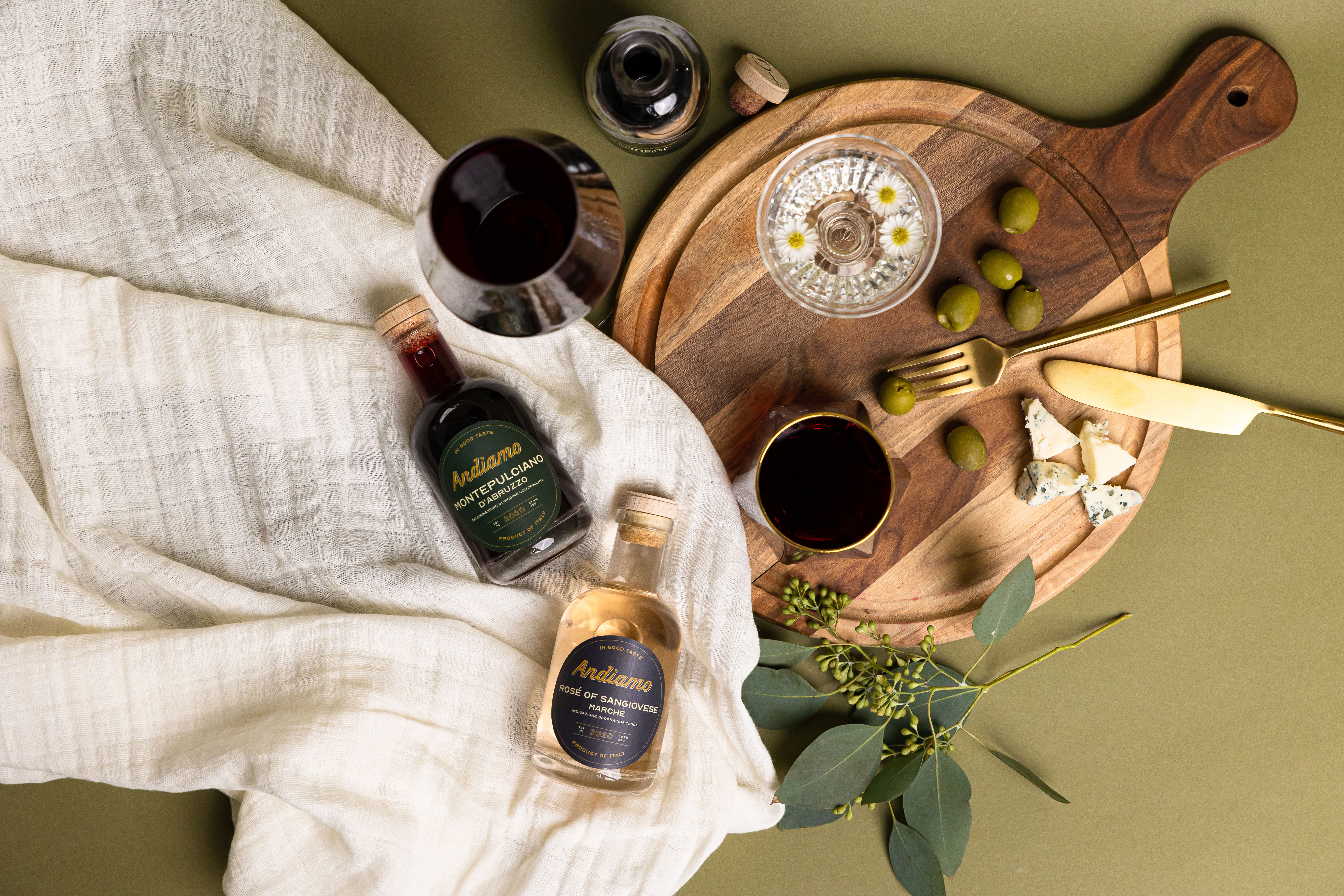
︎ Background
“Andiamo” means “let’s go” in Italian, and with this brand, we’re transported to the famous winemaking regions of the Old World. After working with our creative strategist on naming and brand positioning, I created a look for the brand, crafted label designs, and created guidelines for how the brand would be photographed.


︎ Behind the Design
My goal for this brand was for it to feel like something you’d find on the shelf of a fancy specialty food store. An ode to Art Deco Italian signage, the Andiamo logo is as classic as the wines inside the bottles. The color palette for Andiamo is dark, bold, and luxurious. The label color for red wines is dark green, purple for white wines, and dark blue for rosé. Typography for the Andiamo brand is pared down to reflect luxury packaging. The photos were styled to feel romantic and classic, with colors that complement the labels and allowed them to stand out.
La Pluma Wines
![]()

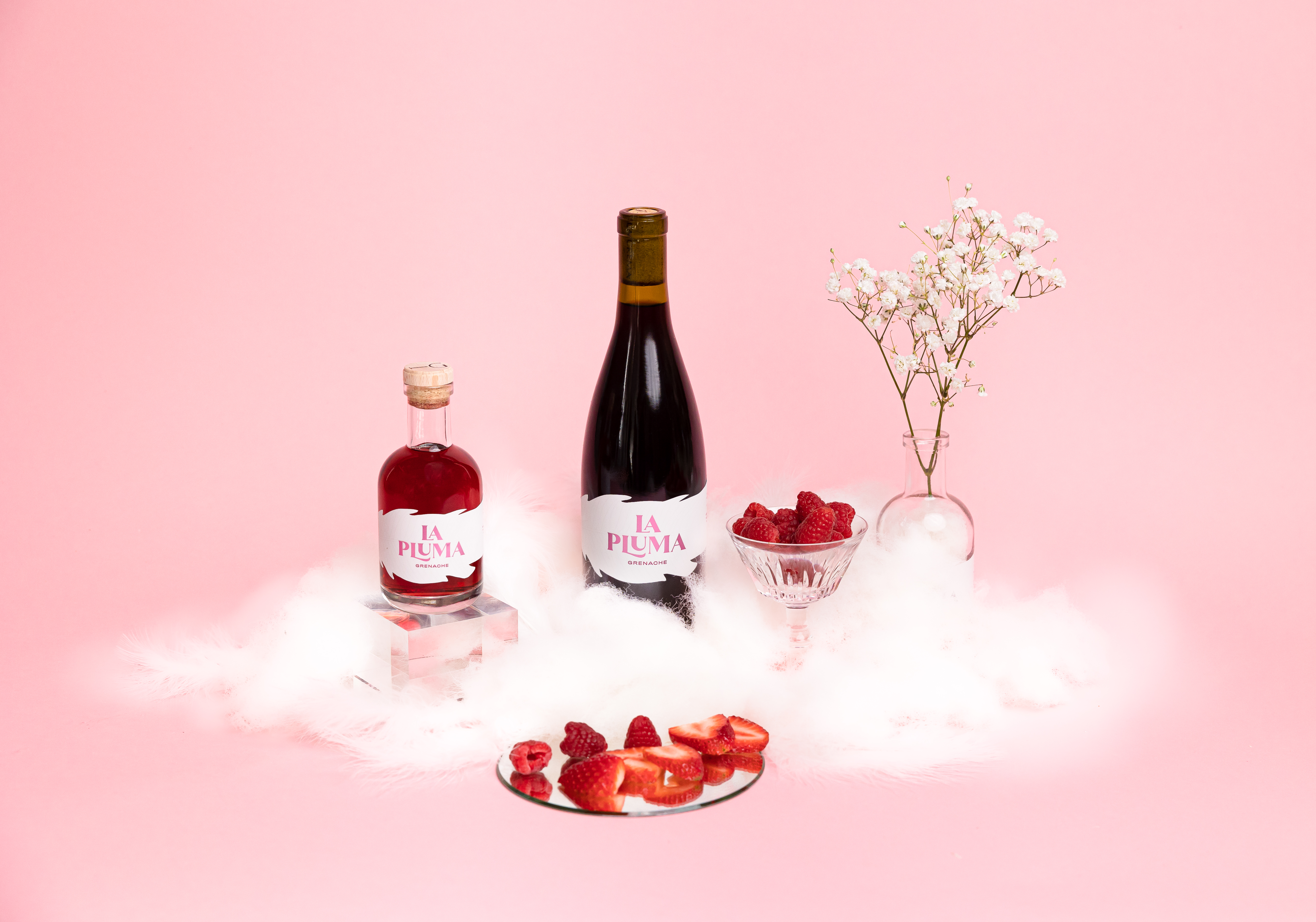
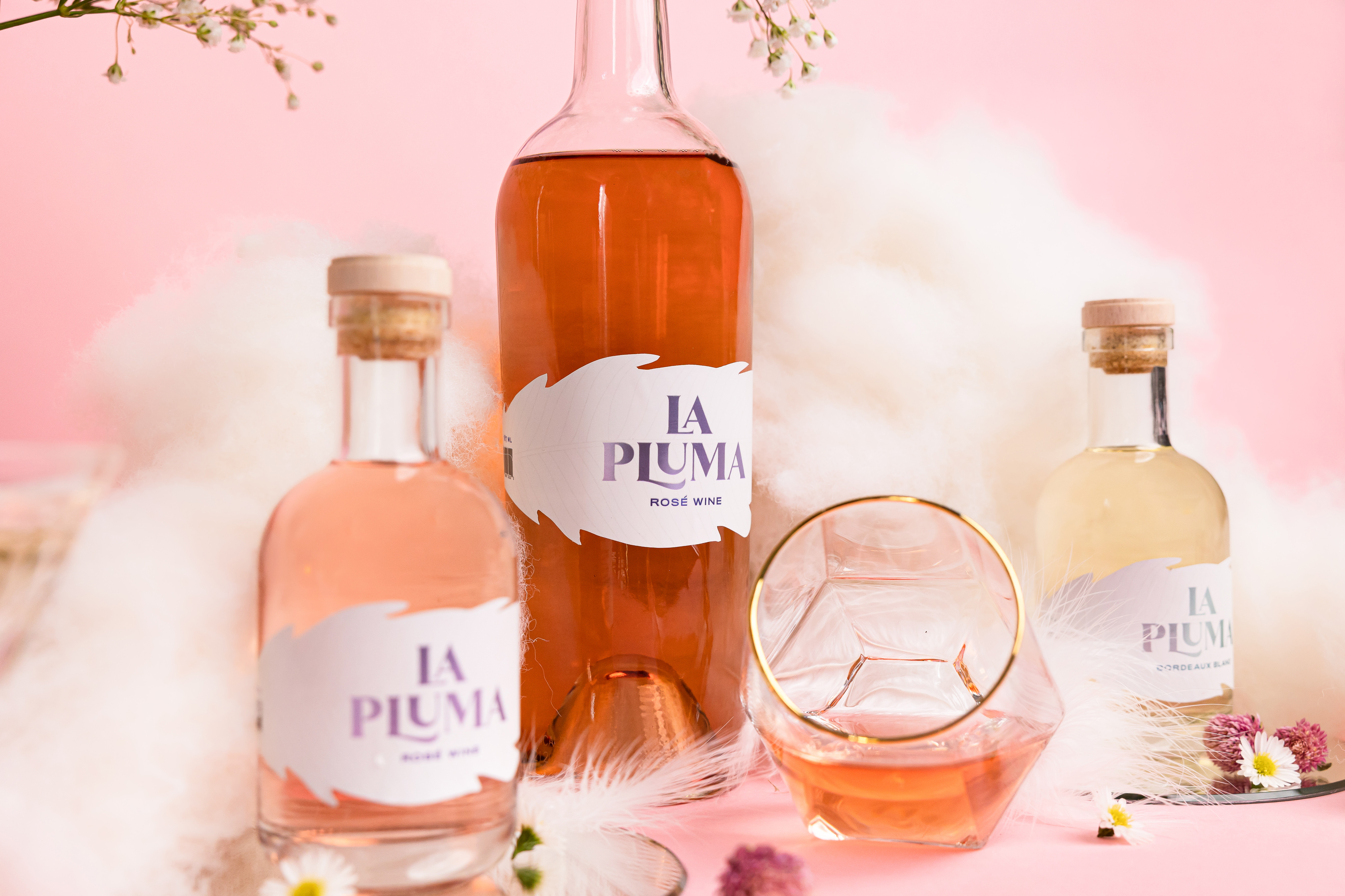
︎ Background
The La Pluma wine brand was an existing IGT brand that was well-liked by customers. The existing logo was too thin, rendering the label hard to read at such a small size (the printable height of the mini bottles is under 3”!). I refreshed this brand with a bolder calligraphic logo, a new feather shape that was more operations friendly, a coded color system, and guidelines for brand photography.


︎ Behind the Design
The La Pluma logo is inspired by calligraphic feather plume pens, with classic thicker down strokes, and thinner upstrokes. The color palette for La Pluma is light and airy like the wines inside the bottles. The La Pluma logo is printed using metallic foil on the labels, and the label wraps nearly the full circumference of the bottle. The feather shape is a nod to the feather pen the brand is named after. Photo styling for this brand is feminine, dreamy, and airy.
Passport Wines

︎ Background
Passport Wines is a brand that was created to feature wines from around the world - taking customers on a journey while travel was essentially canceled (hello pandemic!). This brand was a spin-off of IGT’s Passport Collection and celebrates the renowned mastery of French winemaking, with a more approachable and modern take.


︎ Behind the Design
The logo for Passport Wines is stylized after the front cover of a U.S. passport book. The gold crest reflects a passport cover, as well as the familial crests found on many classic French wine labels. From shape and hierarchy to color and typography, the Passport labels are modeled after traditional French wine labels, but with a more modern take. The labels are cream beige with pops of color, coded by type of wine (red, white, rosé). Photo styling is minimal, romantic, and light to compliment the brand and its labels.
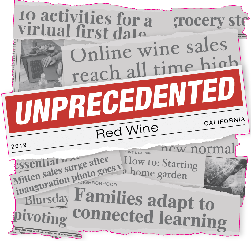
Unprecedented Wines
![]()

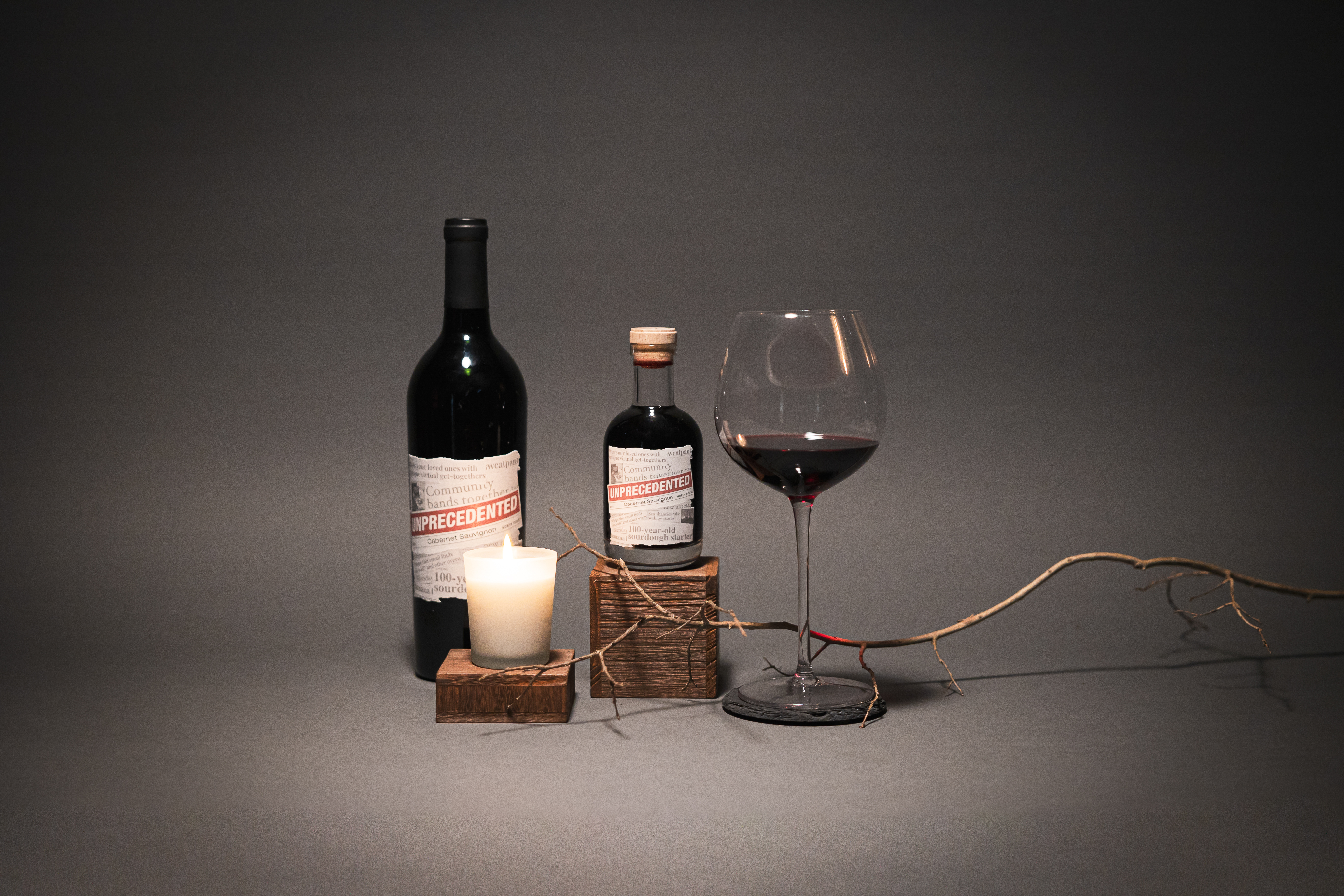
︎ Background
A play on everyone’s favorite overused saying of 2020, “unprecedented times”, this brand aims to bring some satire and levity into an otherwise dark time. Unprecedented Wines was created to be IGT’s “Signature Collection” and features well-known varietals from the company’s home state of California. The logo and labels are inspired by the news, shying away from anything too serious or potentially triggering.


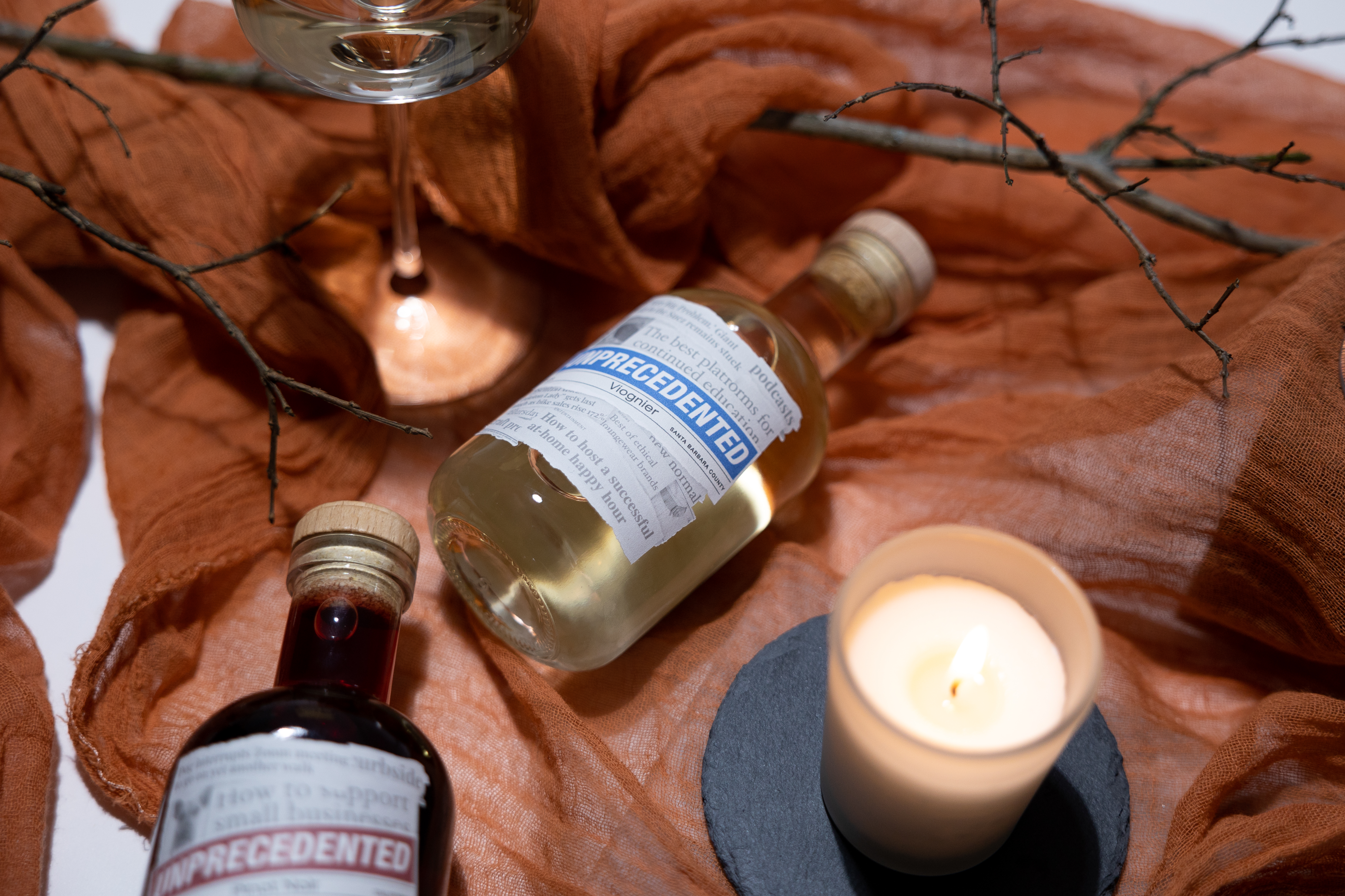


︎ Behind the Design
The Unprecedented logo is inspired by a newspaper masthead. Similar to a newspaper, the brand’s color palette is very simple and clean. Typography is a mix of 3 serif fonts for the headline designs, to mimic traditional newspaper headlines. While the die line is the same across all bottles, the headlines and images change on each bottle (I write my own copy, folks!). In juxtaposition to the light and often funny headlines, art direction for this brand was dark and moody.
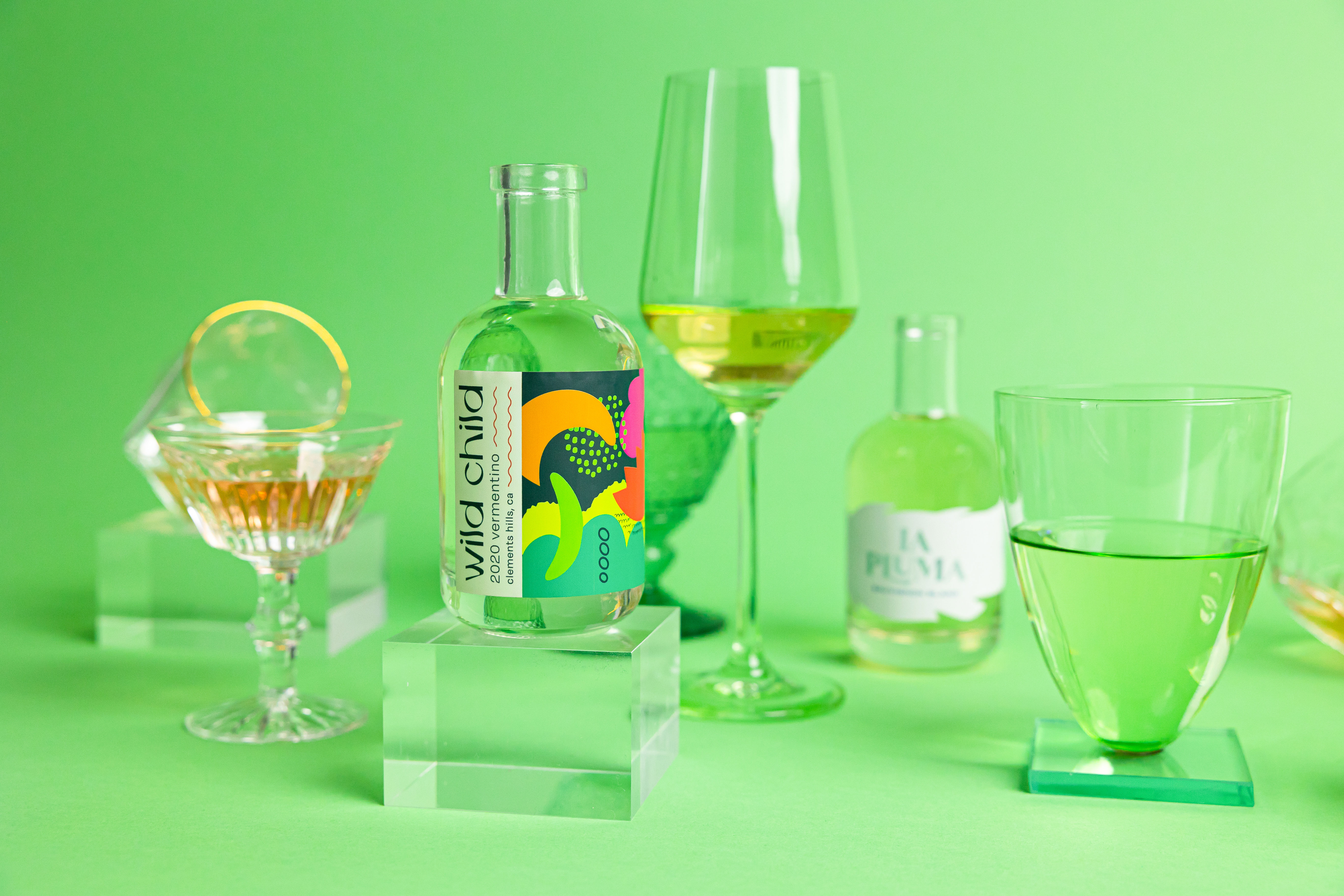
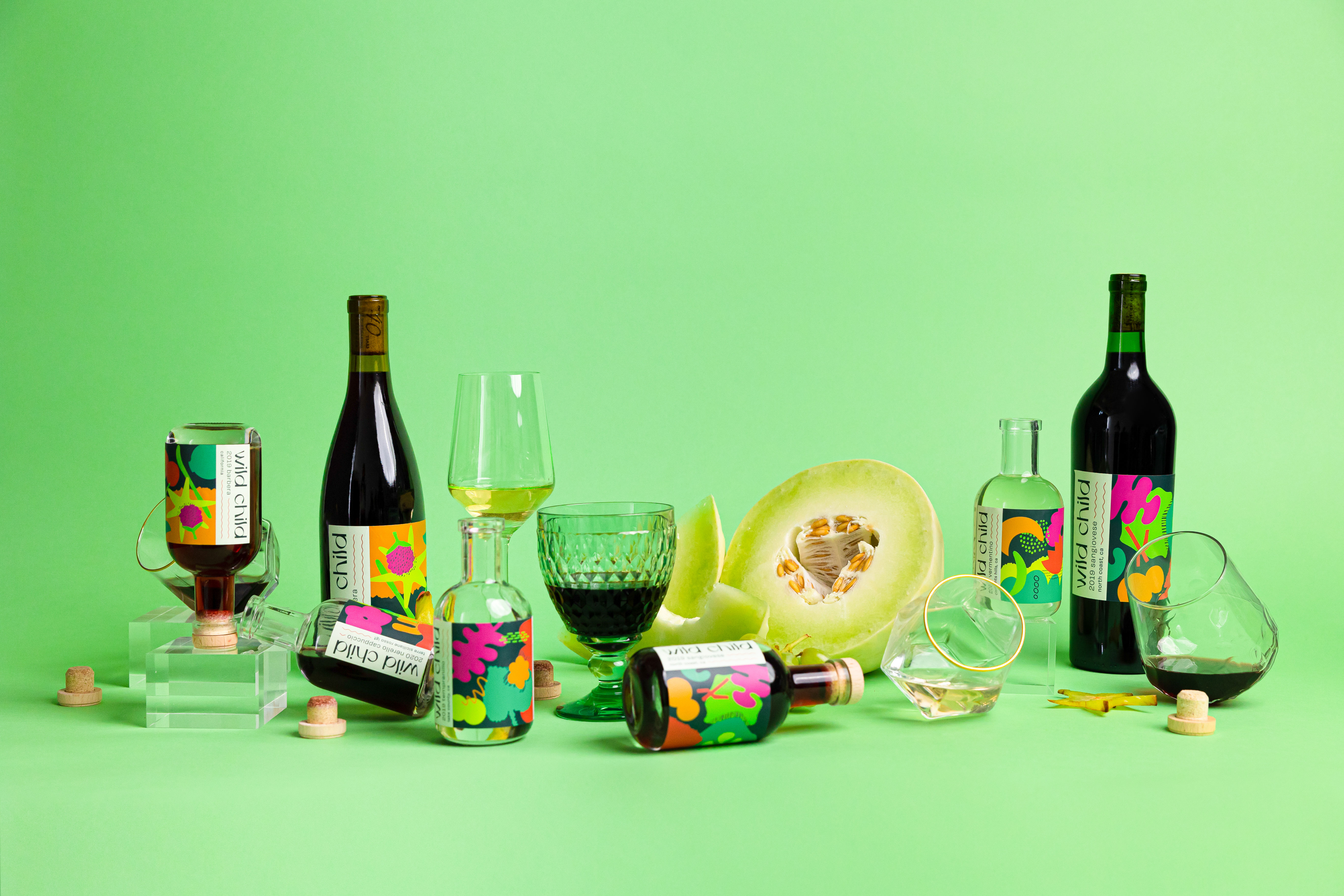
Wild Child Wines

︎ Background
Wild Child is the most fun and vibrant brand in the IGT portfolio. This brand was created to showcase lesser-known varietals and a more ~wild~ side of wine. Once customers finish their mini bottles, IGT encourages them to “upcycle” the bottles for other uses - bud vases, propagation vessels, custom oil infusions...etc. My goal for this brand specifically was to create art that customers would be proud and excited to display.


︎ Behind the Design
The Wild Child logo reflects the fun, slightly off-kilter nature of the brand. Unlike the other brands, Wild Child has no color distinction coded to the wine varietal. The color palette is vibrant, saturated, and fun! The Wild Child labels serve as collectible art pieces that vary by varietal. Organic shapes and textures are used to create a custom representation of each wine’s tasting notes, profile, and terroir. Photo art direction for this brand is colorful, with interesting props and angles. It’s my favorite brand of the bunch!